- Ubuntu 11.10 is not finished. There are still plenty of bugs, quirks and other oddities that need fixing.
- What you see here may well change.
- I have smudged out some personal bits, but it should be pretty clear which bits are smudged out.
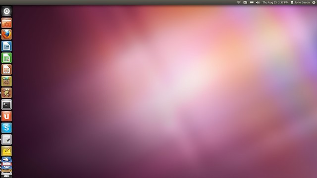 Here you can see a few changes:
- The Ubuntu button is now on the launcher (user testing told us most people look there to launch applications).
- There has been some small changes to the indicators in the top right part of the screen.
- Here you can see I have a number of apps open, and see the concertina effect on the Launcher.
- Note how there are no longer Apps / Files places on the Launcher.
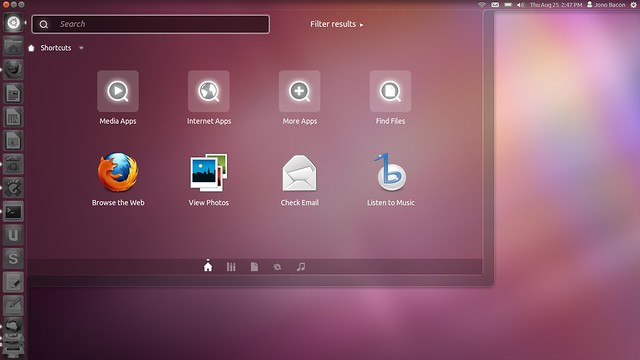 Here the dash opens up in this really nice translucent way, and the launcher and panel look nice and translucent too. The translucency is actually tweaked based upon your wallpaper, so it shades it smartly. You can see at the bottom of the dash are a series of little icons. This is now where you find your different lenses (Apps, Files, a new Music one, Gwibber etc) and this makes it much nicer to see the different types of lens, instead of having to find them on the launcher. Let’s take a look at the Apps lens:
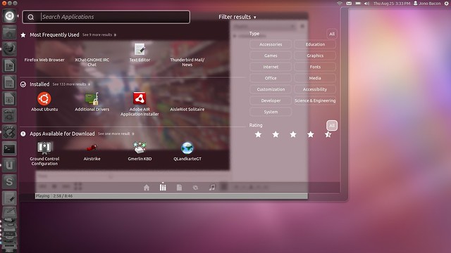
 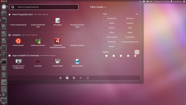 (I know some icons are missing in this screenshot, that is a bug) Here you can see the lens works in a similar way as the apps lens in 11.04, but we have this new Filter Results feature (which is open in this screenshot). Here you can select different categories and those categories will only be shown in the icon view on the left. You can also search by rating which is useful for apps that are shown available to download. Different lenses have different types of filters. As an example, here is the Gwibber lens:
 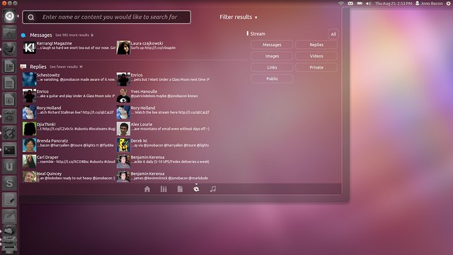 As you can see this provides different methods of displaying different types of content. One other cool element of the dash is that it uses an active blur. This means it really blurs what is behind it, so for example, it will blur a video as it plays behind it in the movie player:
  Let’s now look at loading apps. Here is GEdit in it’s maximized state:
 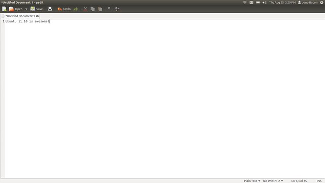 As you can see, Unity provides a lot of workable space and the shell just wraps around the app in the most minimal way possible to give you as much space as possible for the app. You can also see that when maximized the window buttons and menus are not shown; they only appear if you hover the window title with the mouse. This actually makes the desktop feel much nicer and less cluttered. Here you can also see that the toolbar buttons have been styled with the dark theme to carry this theme throughout the desktop. This is a subtle but really nice change. As an example, here is Thunderbird with the same style applied:
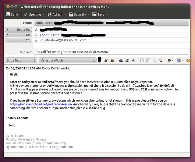
 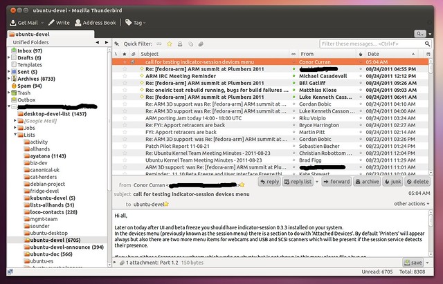 In the GEdit example the icons are not monochrome but the Thunderbird ones are. We are not expecting an icon refresh in Ubuntu 11.10, but I suspect in the future we will see more icons tuned for the darker toolbars. Here is the compose window:
  An app that has had quite a refresh has been Gwibber:
 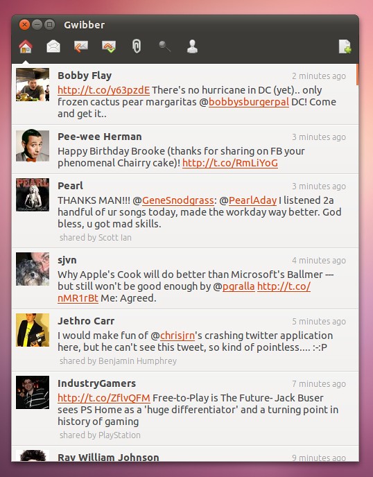 Gwibber is now much faster, much sleeker to use, and just a far more pleasant social networking experience. It also looks wonderfully consistent with the dark theme. Another app that has been re-jigged is the Ubuntu Software Center:
 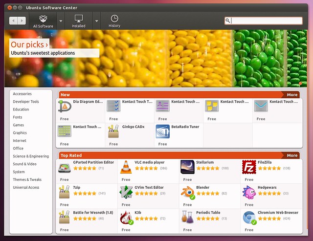 The new Ubuntu Software Center feels faster, is more interesting to look at and explore, and feels far more integrated into the system. I am also delighted to see the wonderful work that has gone into the GNOME Control Center in GNOME3 also brings the same consistent look, feel, and ease of use:
 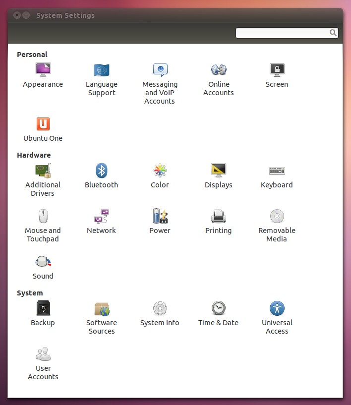 The whole configuration experience feels slicker and easier, and here is one of the panels:
 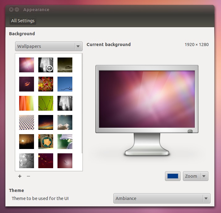 Let’s now talk indicators:
 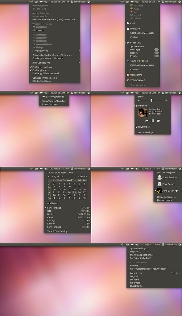 Lots of great work and stability improvements has been performed here such as adding settings links that are relevant to each indicator, improved power and me indicators and other improvements. Finally, a wonderful new feature added is the refreshed Alt-Tab switcher:
  I absolutely love how this works, and I love how it shares the look and feel of the wider desktop. Here you can hit Alt-Tab and then use the arrow keys to move around to select the app you want to see. If there are more apps open than space in the switcher, they concertina just like in the launcher — it looks really cool. If you have multiple windows open for an app (e.g. Firefox), you can find the icon and press the down arrow to show the multiple windows:
  …and that pretty much wraps up the screenshot tour. I hope you enjoyed having a leaf through some of the features you can expect to see in Ubuntu 11.10. I am really excited for the release, and I particularly enjoy how integrated, unified, consistent and slick the entire system feels. I also love the fact that the design, colouring, and structure is noticeably Ubuntu. So, all in all, I am really looking forward to Ubuntu 11.10 and the opportunity it has to put Free Software in the hands of more and more people. Thanks to everyone in the community who has contributed to it so far! Beta 1 will be here on the 1st September, so get ready to test it my friends!


0sem comentários ainda